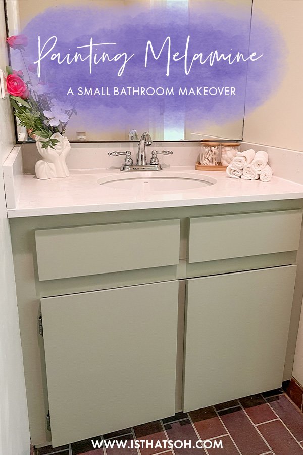
HOW TO PAINT MELAMINE CABINETS - A SMALL BATHROOM MAKEOVER DIY

BATHROOM MAKEOVER DIY - PAINTING MELAMINE CABINETS

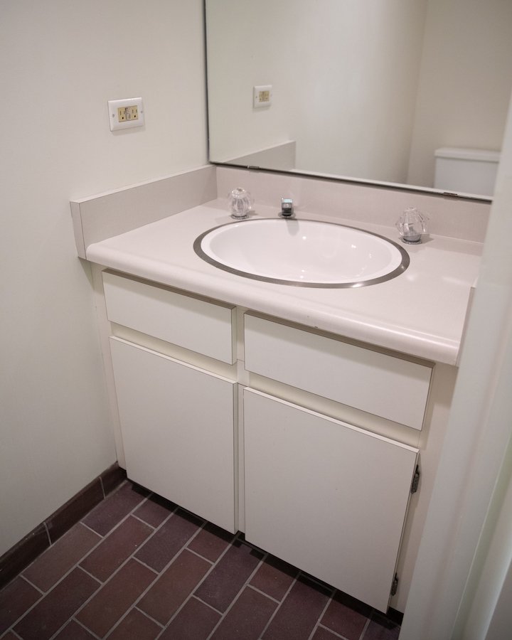
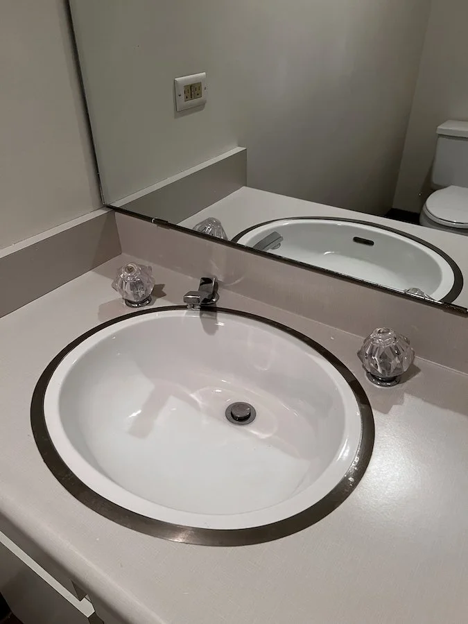
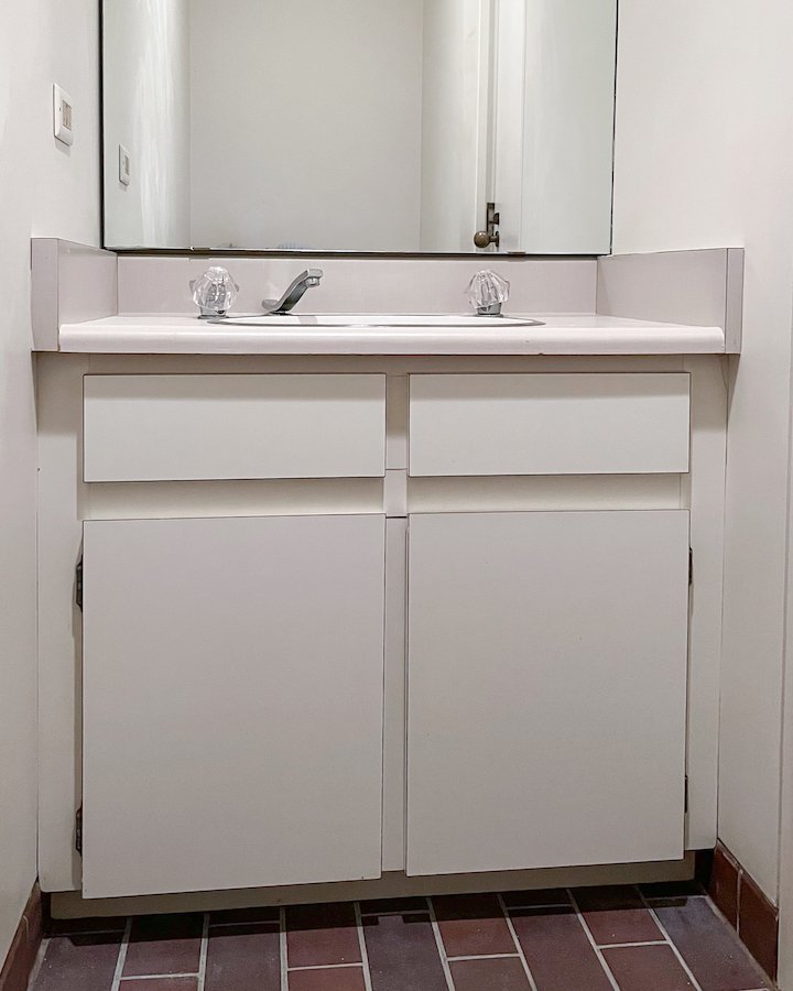
So I was at my mom’s house the other day and she asked if I could help her with her powder room. Essentially the powder room in her basement is so out of date it’s practically screaming for help. It has had the same melamine counter top and vanity since the house was built over 30 years ago. To make it worse, it also has a super gross drop-in sink and old acrylic faucet knobs that need to go!

In order to update this bathroom I decided to upgrade the counter top and faucet with something nice but keep the melamine vanity as is and just give it a fresh coat of paint.

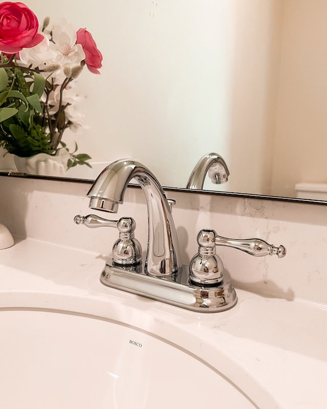
For the counter top I went with white quarts with an under-mount sink already installed from a local fabricator. The counter top and sink cost me under $400. The faucet I got at Canadian Tire was simple and in chrome. It was on sale and was under $100 so I was really happy about that. I also got my paint brush, a small foam roller, a painter tray, and some painters tape while at Canadian Tire, which was another $30-ish.


FOLLOW ME ON INSTAGRAM @ISTHATSOH


Can You Paint Melamine?

When it comes to the melamine vanity, I had plans to paint it. Painting melamine cabinets is actually super easy it just takes awhile because you have to let the paint dry in between coats. Before you paint any melamine surfaces it is important to roughen up the surface before applying a primer though so that the colour paint adheres properly to the melamine.

Bathroom Vanity Makeover - Before Photos

When you are starting a project like this the first thing to do is prep your space. I like to put some cardboard down to protect the floor and remove any hardware. In this case both the hinges and doors needed to be removed. I tried to remove the fake drawers as well but the sink was in the way and I was unable to get in there to remove the screws, so I just left them attached.

MELAMINE CABINET MAKEOVER

Home DIY Projects - Bathroom Makeover DIY - Painting cabinets

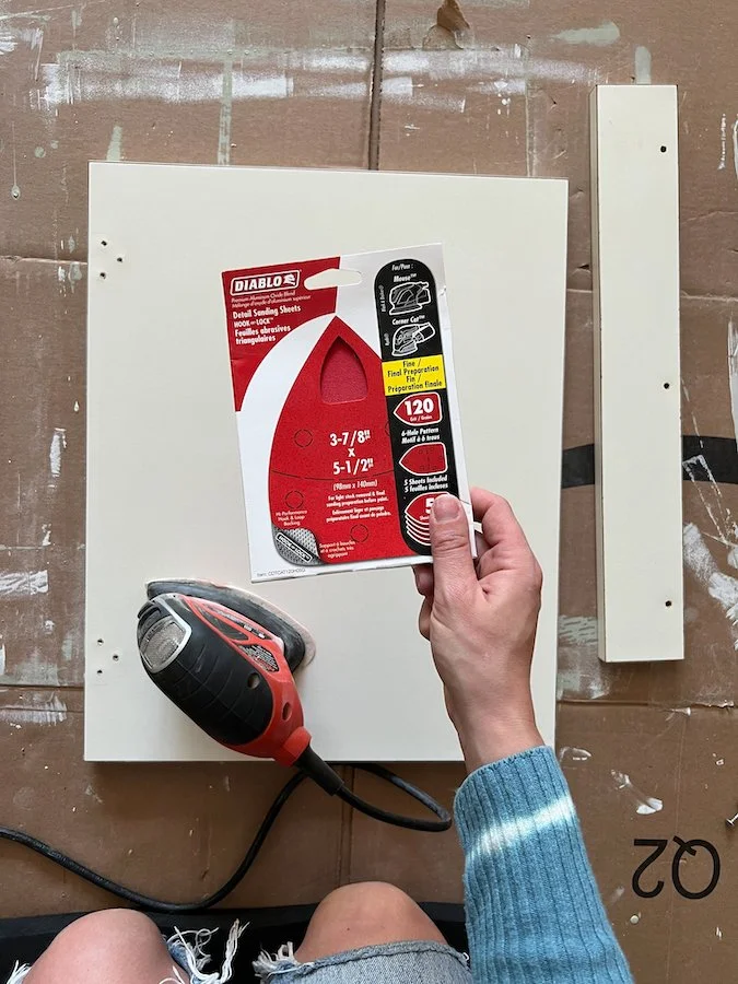
Next I sanded the melamine vanity down using 120 grit sandpaper and my sanding mouse.

NOTE: You want to roughen up the surface so that the primer paint adheres well to it but you don’t want to over sand it to the point you start to dull corners or ruin the surface.

In places that I couldn’t get into with my sanding mouse I went in by hand with some sanding paper.

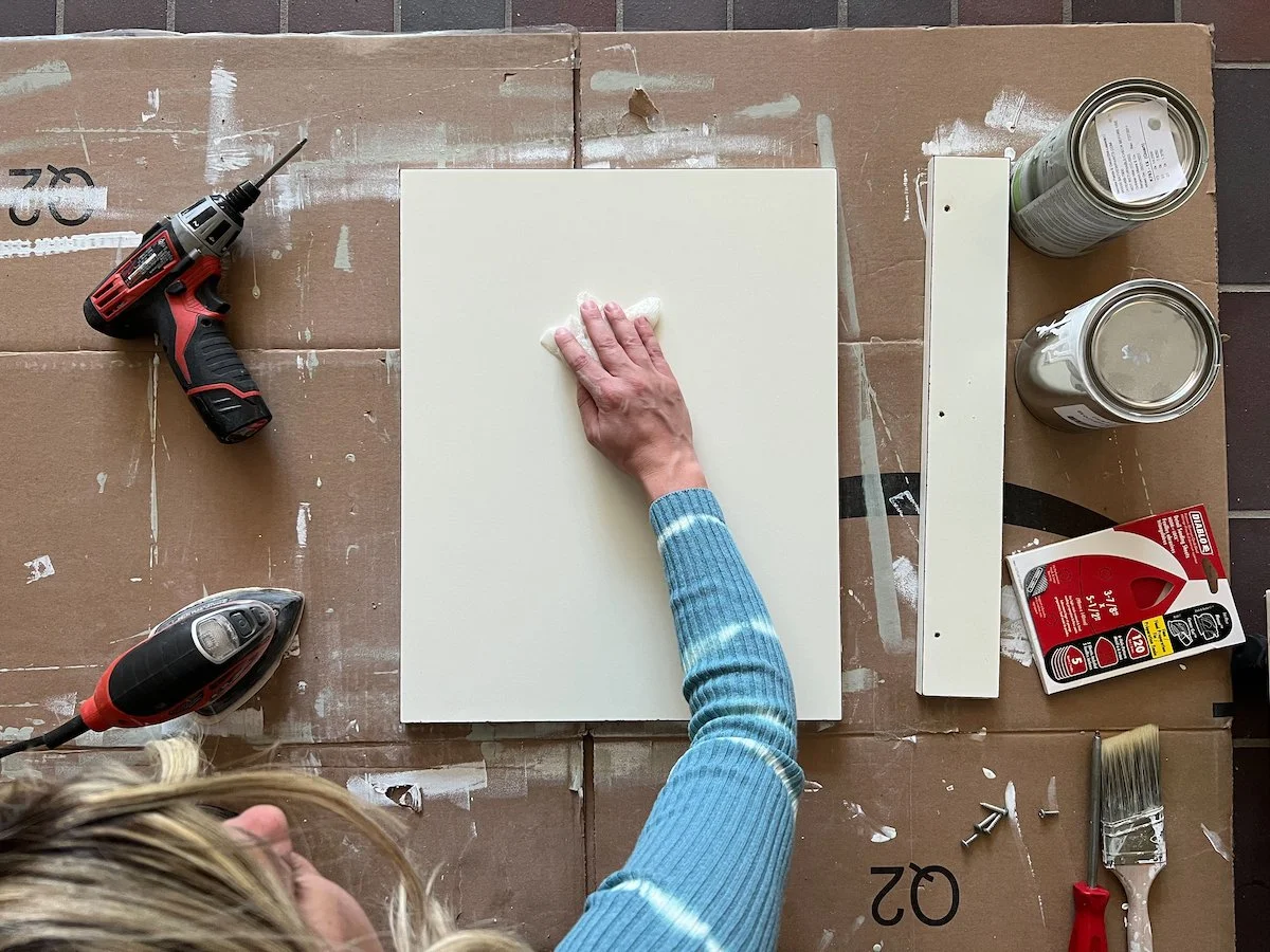
After you are done sanding take a damp cloth and wipe the whole vanity down.

While the vanity dries, repeat those three steps with the doors making sure to sand down and wipe the sides of the vanity doors.

PAINTING CABINETS

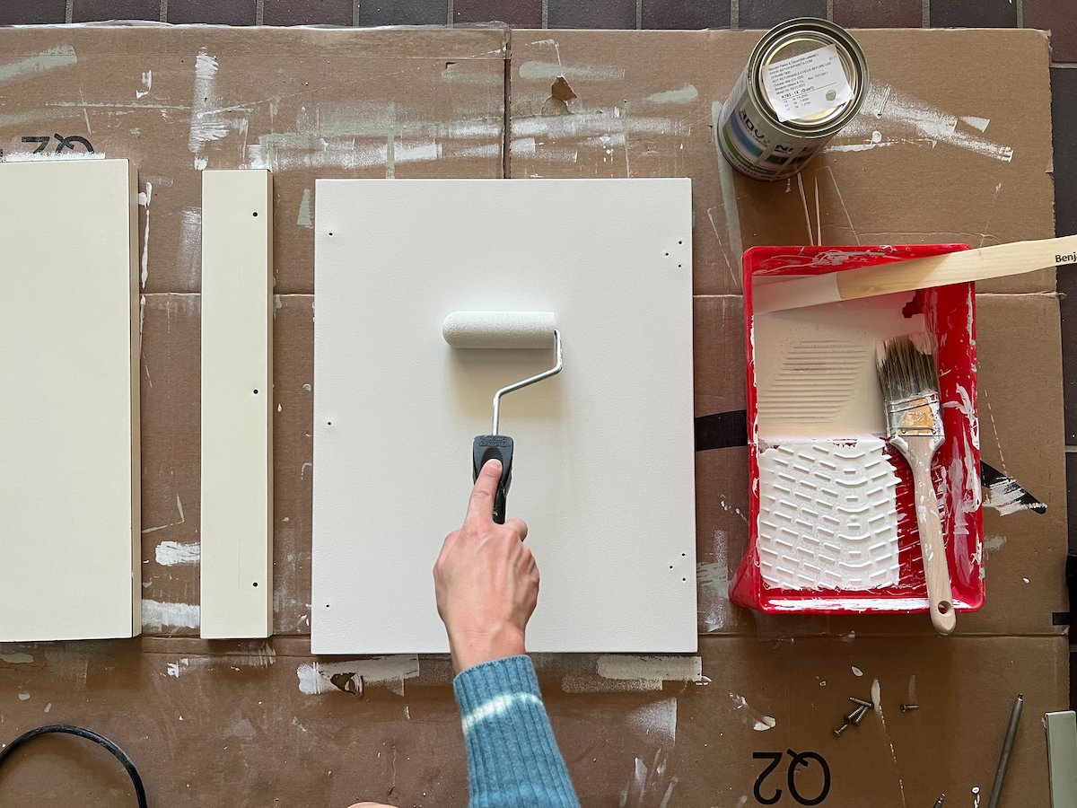
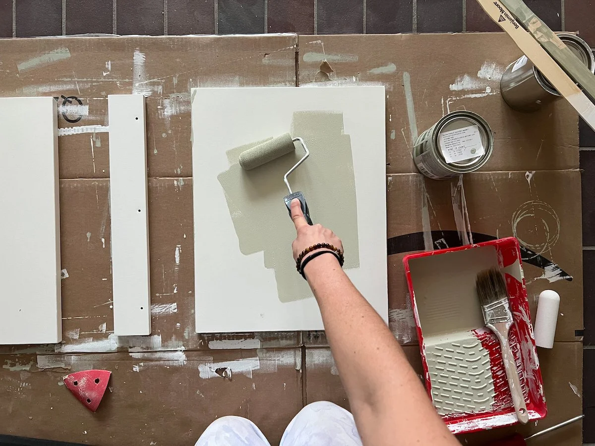
Once everything is dry you can start painting the melamine cabinets with your first coat of primer. I like to paint one side and 3 of the 4 edges of each door first then let it dry for 12 hours before returning and doing the opposite side and final edge.

I used a small foam roller on the doors and a mix of roller and brush on the vanity.

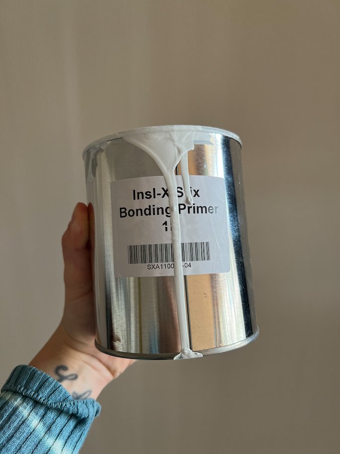
I purchased 1 quart of Benjamin Moore Stix® Waterborne Bonding Primer for this project and it was more than enough.

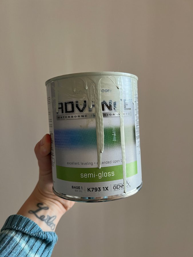
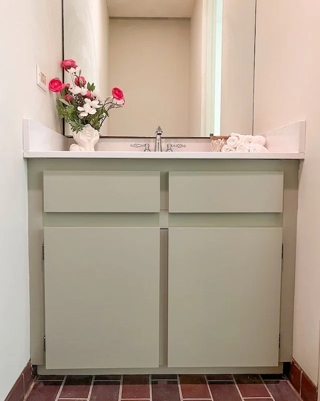
After both sides have been primed and given time to dry, I then did two coats of Benjamin Moore ADVANCE Interior Paint- Semi Gloss in ‘October Mist’ which is this beautiful sage green colour that is so popular right now and one of my favourites.

Home DIY Projects - Bathroom Makeover DIY - painting a vanity

I used the Benjamin Moore colour ‘October Mist’ for this bathroom vanity makover

As for the doors I used the same technique of painting one side and 3 of the 4 edges before leaving that to dry for 12 hours and returning to do the other side and last edge.

Once you get two colour coats on both the vanity and doors, and everything has fully dried, you can go ahead and reinstall your doors.


ENJOYING THIS POST? CHECK OUT THESE OTHER LIFESTYLE POSTS!


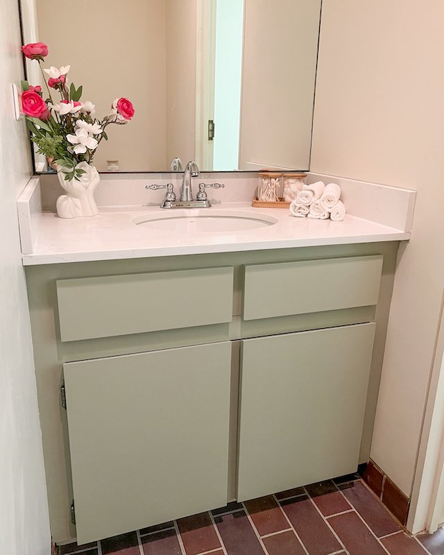
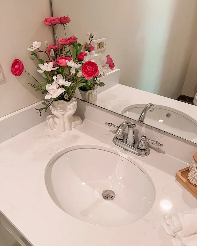
After I finished painting the vanity, the new quarts countertop with an undermount sink went in along with my new faucet from Canadian Tire and voila, my bathroom makeover is complete!

Home DIY Projects - Bathroom Makeover DIY - painting melamine

My Small Bathroom Makeover DIY After Painting Melamine Cabinets


Thank you for joining me today as I shared this bathroom vanity makeover with you. I hope enjoyed this bathroom makeover DIY and found painting melamine cabinets to be easy too. If you have any questions about this bathroom makeover on a budget or have any questions regarding home DIY projects or painting a vanity, feel free to leave them in the comment section below!

Until next time!

-S


PIN THIS POST

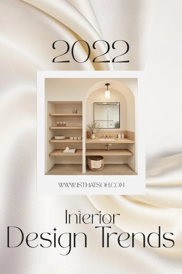
8 INTERIOR DESIGN TRENDS TO WATCH OUT FOR IN 2022!

8 INTERIOR DESIGN TRENDS TO WATCH OUT FOR IN 2022

Image by Ksenia Chernaya

INTERIOR AND HOME DECOR
TRENDS FOR 2022

It has been a long winter and many fresh trends have materialized since my last interior design report. I too have not laid idle and have finally started renovations on my Toronto Victorian home! It seems like dreams and plans are finally colliding and as I continue to collect design inspiration I’ve noticed a few new approaches bubbling up to the surface. Some feel like the natural progression of previous trends while others feel seductively fresh and appealing. One thing is for sure, they all seem to favour bold accents and colours over the previously beloved monochrome aesthetics. We are approaching a time of careful curation and intentional living. Although people are no longer forced to stay home, it continues to be where the majority of their time is spent. Instead of focusing solely on comforts and cozy atmospheres though, there has been a shift as the desire to entertain and welcome guest takes center stage. For that reason, I thought now is the perfect time to share 8 interior design trends for 2022.

BIOPHILIC ARCHITECTURE & DESIGN

Interior Design Trends 2022 - biophilic architecture and design

Biophilic Design by Joe Mortell

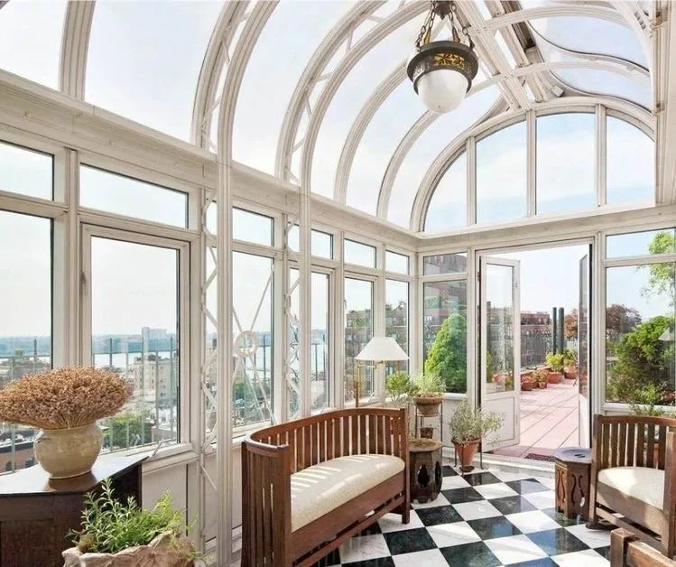
Biophilic Design is the concept of creating a stronger connection to nature while in our home environment. Just because you’re continuing to spend the majority of your time at home doesn’t mean you want to seclude yourself from the outdoors completely. Opening the windows to allow fresh air and natural light in may be the easiest way to remove a rooms stagnant energy, but Biophilic interior design encourages you to take things one creative step further. Use natural materials like timber, concrete and stone to help you imitate elements you would see outdoors or incorporate indoor plants, fresh cut flowers, and foliage for a more obvious approach. Research has also shown that images depicting nature can be effective in producing a calming atmosphere to reduce stress, improve cognitive function and spur creativity while also improving our overall well being and hastening healing. That’s pretty remarkable, if you ask me! Where once using dried flowers like pampers grass used to be a popular decor trend, now it is all about fresh, vibrant, living greens. Additionally, the idea of creating a conservatory at home seems to be ever more appealing as we continue to embrace Biophilic architecture and crave connections to the outdoors.


FOLLOW ME ON INSTAGRAM @ISTHATSOH


THE SLOW BUILD

When it comes to intentional living and careful curation, the slow build plays into peoples' desires to do away with ‘fast furniture’ and pursue more sustainable practices. Artisanal, vintage and one of a kind pieces invite the fascination of your guest and welcome conversation around the stories behind them. They also make your space fell uniquely you! Make time to visit second hand stores and go antiquing when you can. Look for investment pieces that could elevate your collection and consider decluttering to make room for them when you finally do make a purchase. Minimalism is still very much trending so don’t think you need to overwhelm your space with expensive stuff for it to be beautiful. In fact, a few carefully curated items is really all you need.

REIGNITED FASCINATION WITH THE 70S AESTHETIC

Interior Design Trends 2022 - 70s Aesthetic

A livingroom inspired by 70s Interior Design

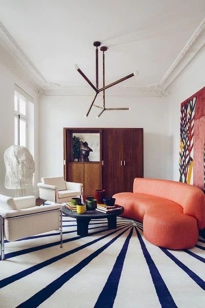
There is no denying that in the past few years cane and rattan decor has seen a major comeback. Perhaps it is because of our fascination with a ’70’s aesthetic’ has been reignited. Where once unique shapes, bold prints, colours, textures and futuristic design were used to express excitement, push boundaries, and create amazing spaces to host parties, today’s mindset echos that. It’s why we love velvet furniture, animal print rugs, and macrame, and why you might be gravitating towards a curved sofa, brightly coloured small appliances or an egg rattan chair. I’m not saying go ahead and install wall to wall shag carpets, but don’t be afraid to play on the psychedelic inspiration of the 70’s aesthetic through the use of bold cushions, prints and cheery colours.

STATEMENT WALLS

Interior design trends 2022 - Statement walls and grandmillennial wallpaper

Hand Painted de Gournay Wallpaper

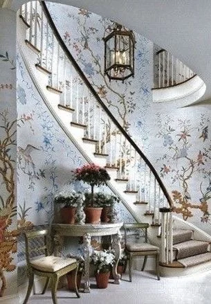
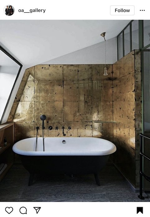
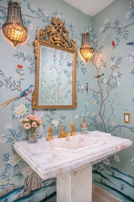
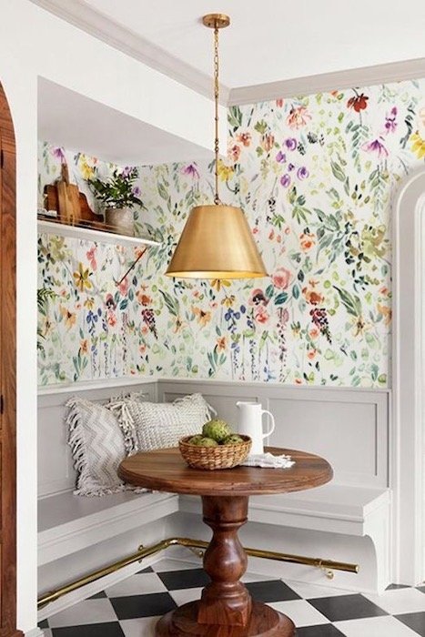
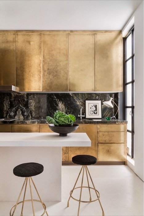
Grandmillennial interiors may not be for everyone but statement walls are still a great way to adds drama to a room or even a whimsical feeling. I’ve seen lots of wallpaper with beautiful, intricate motifs popping up in magazines and my Pinterest feed but none have caught my attention more than de Gournay, a French hand painted wallpaper company who’s designs are simply remarkable. Statement walls are not only being achieved through the use of wallpaper though. Metallic panels are another quick way to draw and hold someone’s attention. The door is left open with this trend and it’s up to you to get creative with how you want to incorporate it into your space.


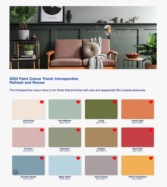
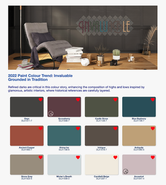
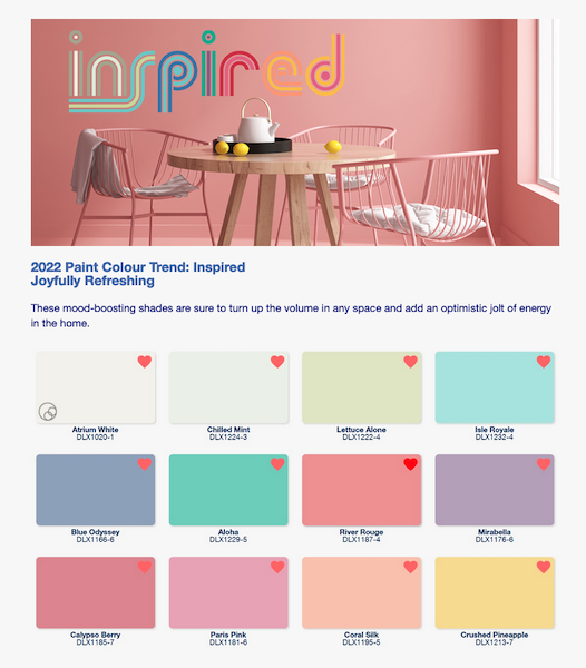
DULUX COLOUR PAINT TRENDS FOR 2022

Dulux colour paint experts identified three colour stories they predict will resonate for homeowners and professional painters in 2022. Born from the overarching theme ‘Horizon’, Dulux says these palettes, “represents our current state of hope, reflection and new beginning.”


ARCHWAY DOORS, CURVED SOFA, EGG SHAPES, CURVES STEAL THE SPOTLIGHT

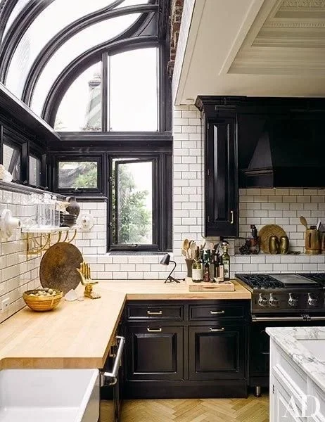
Home Design Trends 2022 - arch design - cathedral archway

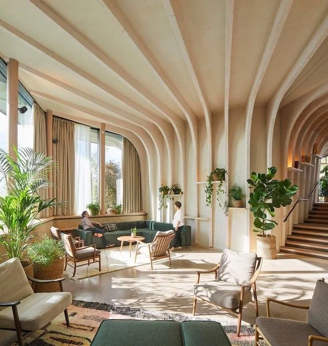
Cathedral archways add a beautiful structural element to this livingroom by Sonja Jonss

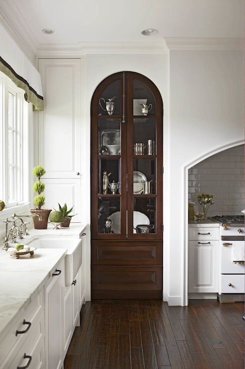
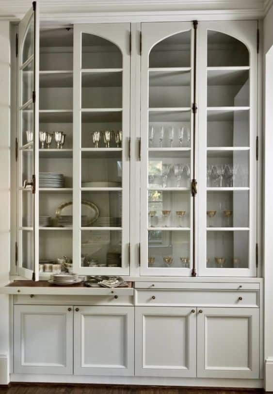
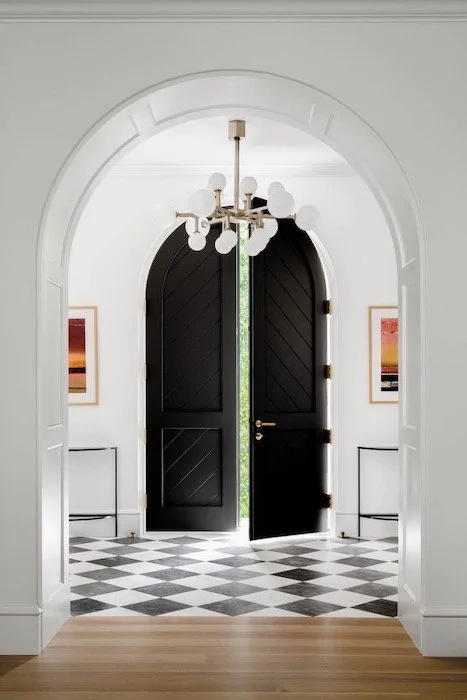
Curves of all kinds seem to be gaining popularity in recent months as structural style furniture like curved sofas, hanging egg chairs, elliptical tables, and even arched mirrors continue to hold our attention. Perhaps it’s our need to be fluid and adaptive to our ever changing environment that has caused our love for curves to now transcend beyond just decor to structural elements within a home like archways, pantry doors, built in bookshelves and windows. Just because curves are in, doesn’t mean straight lines are out. There is definitely enough room in my house for both of them to coexist, ha! I just think curves of all kinds are having a ‘moment’ and I’m here for it.

ATTENTION GRABBING BOLD STRIPES

Palm Beach style from Jennifer Ash Rudick’s new book - morning room of La Follia

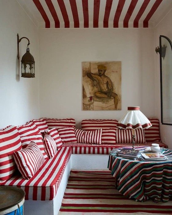
There is something so timeless and elegant about bold stripes that it is no surprise that they are coming back in a big way. A great way to catch peoples attention, incorporating striped rugs, cushions, throws or even wallpaper can give your space a very eye pleasing, contemporary and timeless look. It is also an easy and effective way to give a tired room a full reset. I’ve already seen many home decor design stores running with this trend so it shouldn’t be hard to incorporate either! Just remember, when it comes to the size of the stripe, stick to big thick, bold stripes!


ENJOYING THIS POST? CHECK OUT THESE OTHER LIFESTYLE POSTS!


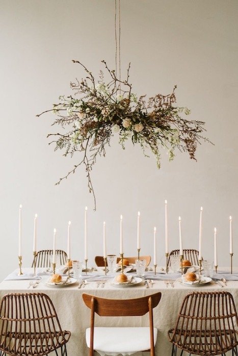
ELABORATE, ELEGANT TABLESCAPES!

2022 home decore trends - elegant tablescapes

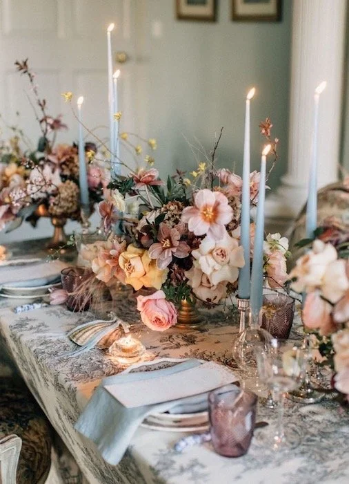
An elegant tablescape captured by Paula O’Hara via Green Wedding Shoes

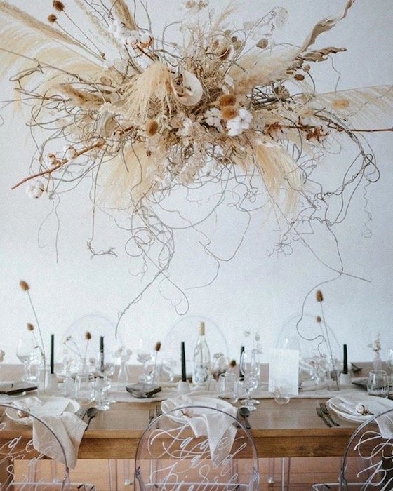
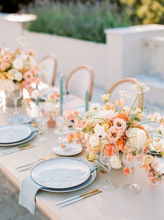
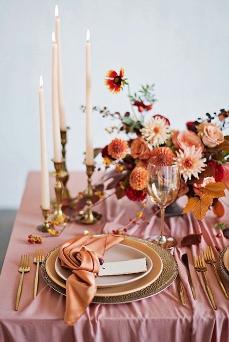
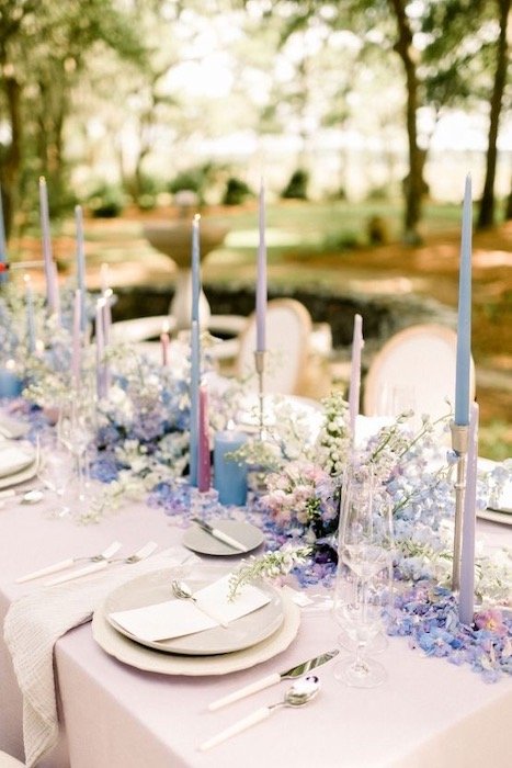
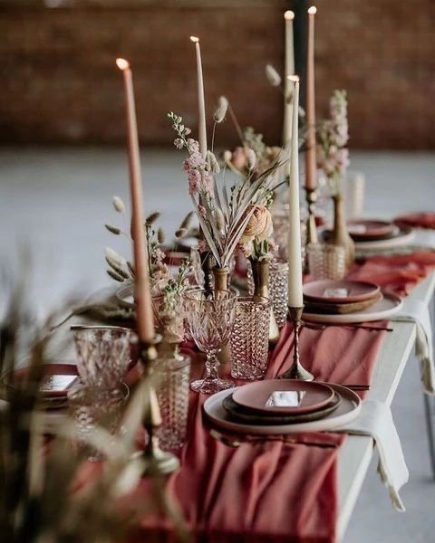
Elegant tablescape go hand in hand with entertaining which is why elaborate arrangements with linen napkins, candles and flowers are going to be all the range. People don’t just want to welcome people into their homes again, they want to dazzle guest and set the stage to an unforgettable evening. A little more effort and care will be put into presentation because distance from our friends and family only made the heart grow fonder. If you need inspiration for your next dinner party, here are some tablescapes I’m currently swooning over.

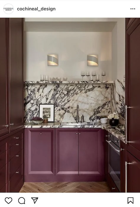
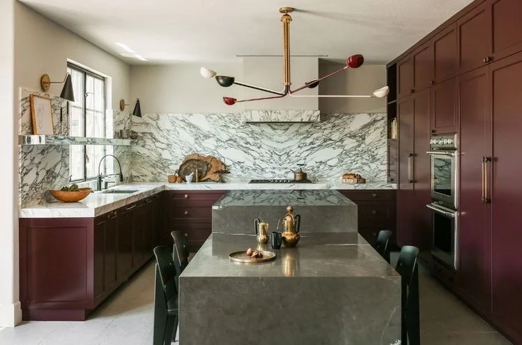
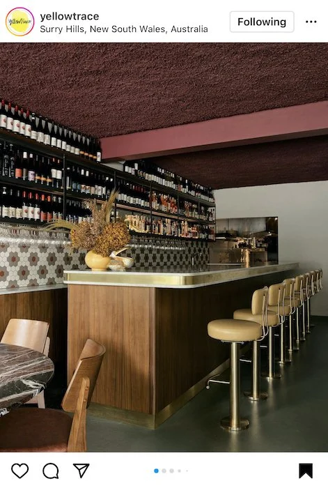
RASPBERRY CABINETRY

Raspberry Kitchen Cabinetry by Cochineal Design

Earlier on in the year I stumbled across my first raspberry kitchen and instantly fell in love, sharing it on my Instagram stories! Since then raspberry cabinetry has been popping up everywhere which makes me feel even more invested! Research shows that the colour of a room can impact our moods and reds are said to ignite your appetite. How fitting it is then that we find the sex appeal and moodiness of raspberry cabinetry alluring! Furthermore it goes well with all wood tones and earthy browns often found in home decor. Moody kitchens aren’t for the faint of heart through. You may not want to commit to a whole kitchen in raspberry cabinetry but that doesn’t mean it can’t also find its place in a powder room or pantry! I myself don’t know if I’ll be partaking in this trend but that doesn’t meant I’m not excited to watch where the trend goes.


Thank you for joining me today and taking interest in the 8 interior design trends I have uncovered for 2022! If you have any questions or comments about biophillic design, the 70’s aesthetic, archway doors and designs, or decor trends like rattan decor and curved sectional sofa, feel free to leave them in the comment section below!

Until next time,

-S

PIN THIS POST

EPISODE 1: SLEDGEHAMMER THERAPY - RENOVATING MY TORONTO VICTORIAN HOME

The front window of our Toronto Victorian Home that we are currently in the process of renovating!

TORONTO VICTORIAN HOME RENOVATIONS
IT’S FINALLY HAPPENING!

Today I am so excited to be sharing the first episode in my new YouTube series about my Toronto Victorian home renovations!

If this is your first time visiting my blog, last year my fiance and I started the process of buying our first home in Toronto.

It took us a stressful 6 months and a total of 11 offers until we finally won a bid on a beautiful Victorian home in Old Toronto’s trendy Little Portugal neighbourhood. Since moving in last August we have been planning a number of home renovations including a major first floor gut and remodel.

Finally, after weeks of waiting and months of planning, we finally got our Toronto Building Permit and were able to start. Since the house does need some structural work we did need to apply for a permit but I’ll wait to share more about that in my next episode!


FOLLOW ME ON INSTAGRAM @ISTHATSOH


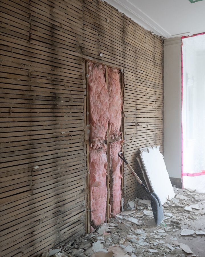
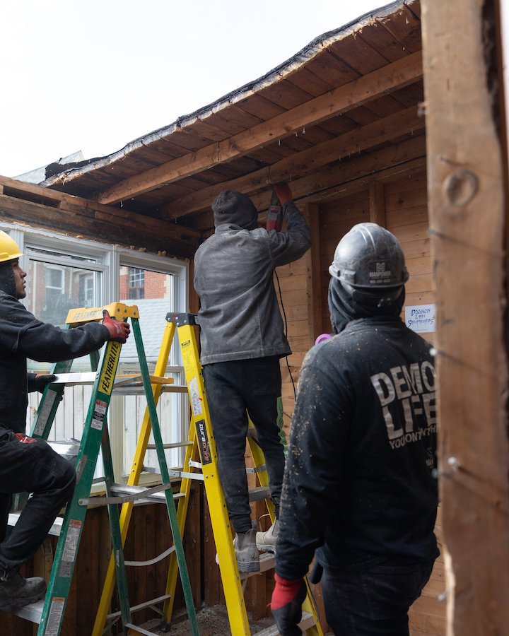
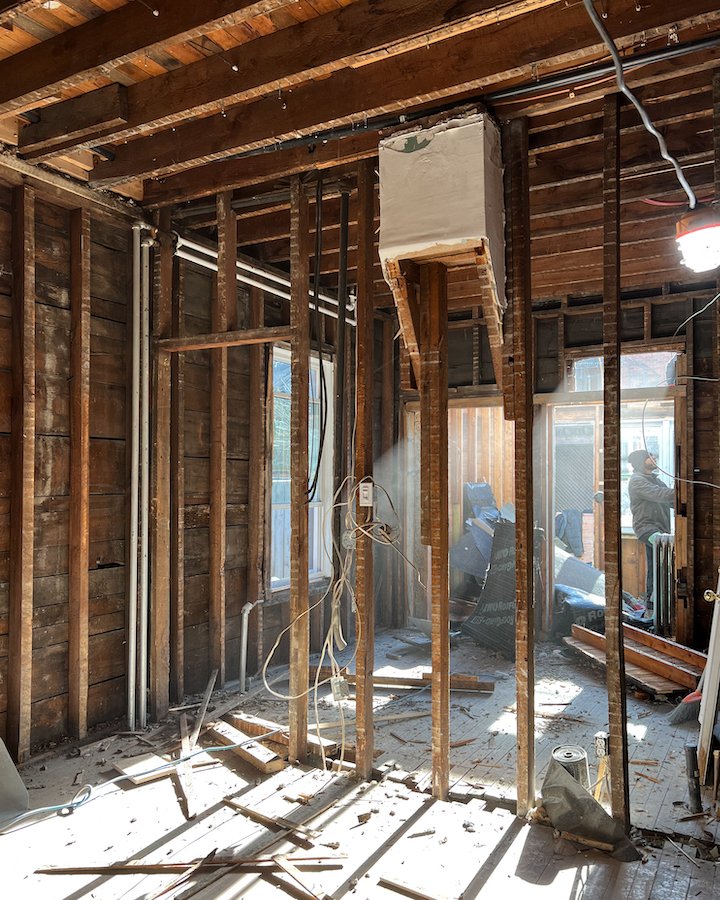
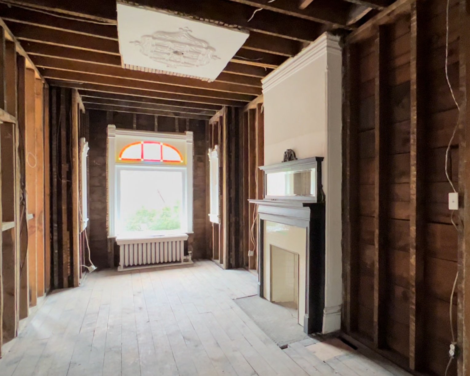
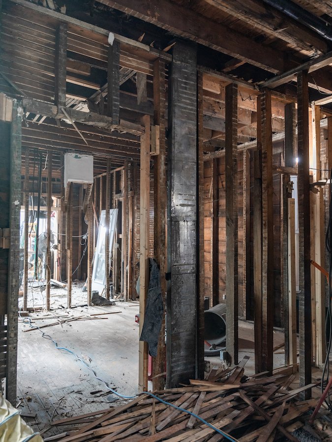
In this episode my fiance and I talk about how we are feeling going into our home renovations, the prep work that needed to be done before we could start and I vlog the entire demolition process. In total, it took 5 days to completely gut the first floor (don’t worry I saved the beautiful mouldings and doors) and remove the sun-room at the back of the house but you won’t believe what we found during the demolition process!

Although Adam, his dad and I did the demo in the basement, we did hire Manpower Demolition Inc. to help us gut the first floor and complete the first stage of our Toronto home renovation. Since the basement was drywall and only two walls, it was super easy for us to do ourselves but when it came to super messy lath and plaster, and saving my decorative mouldings, we decided to hire seasoned experts.

In the end, we were super happy with the work and professionalism of Manpower, and how accommodating they were. Prior to even starting, I did a walk through with one of their project managers and showed him everything I wanted saved, protected and stored. They were also very accommodating during the documentation process, moving time lapse cameras around for me and letting me on site to take photos while they work.

Obviously, when you do a renovation like this you also want to make sure that you aren’t being excessively disruptive to your neighbours. Since we didn’t have a permit to leave a disposal bin on the street we had to do a drive by bin and I was happy to hear from my neighbour that Manpower cleaned up after themselves and didn’t leave any mess behind after loading each bin. I also requested for all the garbage from the demo to be brought through the house instead of down the shared lane way as to avoid damaging or scratch my neighbours newly painted house, which they did as well. All in all they did a great job and I would totally recommend them to other friend and family, and use them again myself!

P.s. If you are starting a Toronto home renovation and need some contractor recommendations Adam and I have put together a stellar list of contractors and tradesman for this project! I’ll be sharing more about our renovation process in upcoming episodes and the companies we are using but if you can’t wait, feel free to leave a comment below or shoot me an email via my contact form for a recommendation!

PICTURES OF MY OLD VICTORIAN HOUSE

Although I do walk you through the main floor of the house prior to the demo in this episode, here are some picture of the rooms we will be demolishing. We did keep all the decorative crown mouldings around the windows in the front room and pulled off the decorative crowns on the doorway frames but things like the baseboards and door frames we are planning on getting milled/replicated. We are also planning to reintroduce the decorative bullnose wall corner details you see in the middle photo (above) as a way of paying homage to the houses original character.

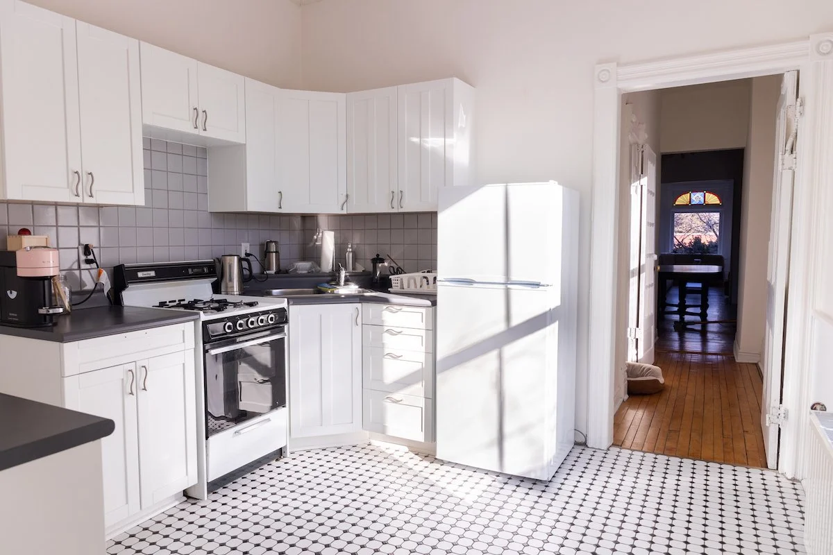
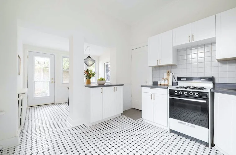
The old main floor kitchen that we are planning to completely remodel!

One thing I am super excited for is renovating our kitchen!

The house currently has two kitchens and the main floor kitchen definitely leaves much to be desired. I am so looking forward to modernizing this room in our Toronto Victorian home and bringing it to life with the help of Domani Design Group. We went all out on this part of the house and purchased the best of the best kitchen appliances, so I’m super excited for those for those to arrive at the end of the month. Especially my La Cornue stove!

TORONTO HOME RENOVATIONS - MODERNIZING A VICTORIAN HOME

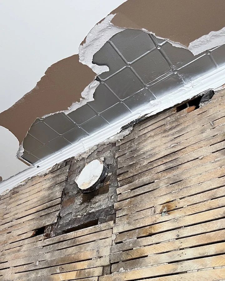
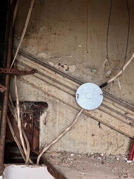
During the demolition we did uncover a few cool things! For one, the boys at Manpower uncovered the remains of a tin ceiling under the drywall in the kitchen. Turns out it wasn’t actually tin but a faux tin material that was raised to give the same aesthetic. We didn’t save it but I thought it was a pretty cool discovery especially since i’ve been contemplating doing a tin cieling in the kitchen and talking about this idea on Instagram. Perhaps it’s a sign!

The faux tin ceiling we uncovered during the demolition of the main floor kitchen! Learn more in my Toronto Home renovation series on YouTube!

The faux tin ceiling we uncovered during the demolition of the main floor kitchen! Learn more in my Toronto Home renovation series on YouTube!

Another thing we discovered during the demolition was some old school coat hooks hidden in the abandoned staircase! This we definitely did save and I do plan on re-purposing them in the front foyer later on in the renovation! First I’m going to strip the paint off them though!

The antique coat hooks we found during the demolition of the abandoned staircase in my Toronto Victorian home.

The antique coat hooks we found during the demolition of the abandoned staircase in my Toronto Victorian home.


CHECK OUT THESE OTHER HOME & LIFESTYLE BLOG POSTS


PICTURES FROM AFTER THE DEMO STAGE IS COMPLETE IN MY TORONTO HOME RENOVATIONS!

So there you have it!

With stage 1 complete, we can now move onto structural changes that needed to be made to make the house structurally sound. We are going to be remove a load bearing wall in the next episode and installing some steal beams so if you are curious to see what goes into that , stay tuned!!

For now we left up a lot of the old framing so we can continue to give the house some support while we order the new LVL and steal beams but all that and more will be revealed in the next episode of my Toronto Victorian home renovations series!

Make sure to subscribe to my YouTube channel so you don’t miss out!


Thank you so much for joining me today and for checking out my new Toronto home renovation series on Youtube. I am super excited to be modernizing a Victorian home while still keeping the charm of an old Victorian house. If you have any questions about my Victorian house renovations, what it’s like to live in Little Portugal, Toronto or recommendations for Toronto contractors, hit me up in the comments below!


PIN THIS POST

home renovation toronto - Victorian house renovations.jpg

Episode 1 in my Toronto Home Renovation series on YouTube is now out! Make sure to subscribe so you don’t miss an episode!

DIY WREATH FOR SPRING!

Wreath for front door spring - front door wreath for spring

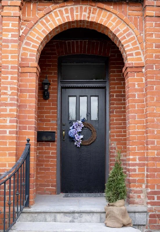
My floral wreath for spring!

DIY WREATH FOR SPRING

After a cold winter, spring is a time of revival. A time to reinvigorate your life and for new beginnings. A time where evidence of dormant plants begins to appear and hibernating animals awake from their slumber. Much like the outside world, I too awaken in the spring with a new sense of energy to create, decorate and prepare for warmer days, but this year things felt different. More purposeful. More rewarding.

Since moving into our new Toronto Victorian home last August, each season has been a completely new experience and opportunity to decorate. In the fall, I used pumpkins to dress up my front step. In the winter, I added festive garlands, planters and ribbons to add holiday cheer. Now with spring upon us I have the urge to add decorations once again, but this time I thought an outdoor spring wreath for the front door would be a perfect accessory. Outdoor spring wreaths are a great way to add a pop of colour to any entrance way and a great way to excite those who see it of warm days ahead.

Having never made a wreath for spring before I wasn’t sure how this project was going to turn out but after a quick trip Michael’s to pick up a grapevine wreath base and a few additional supplies, I was excited to begin creating.

As it turns out, creating an outdoor spring wreath isn’t hard at all! It’s actually super fun, easy to do and took me maybe 40 minutes max. I think the most difficult part of the whole experience was deciding what colour palette I wanted to use and which artificial flowers I was going to buy.


FOLLOW ME ON INSTAGRAM @ISTHATSOH


HOW TO MAKE A WREATH FOR SPRING

To help me get inspired, I went over to Michael’s spring crafting section which had a bunch of pre-made spring outdoor wreaths ready to go. I paid attention at the colours used, the flowers chosen, and how they were constructed before cross referencing with a photo of my front door. Doing this allowed me to confidently pick a colour palette that would not only suit my home but help me determine the size of wreath I wanted and how I would hang it.

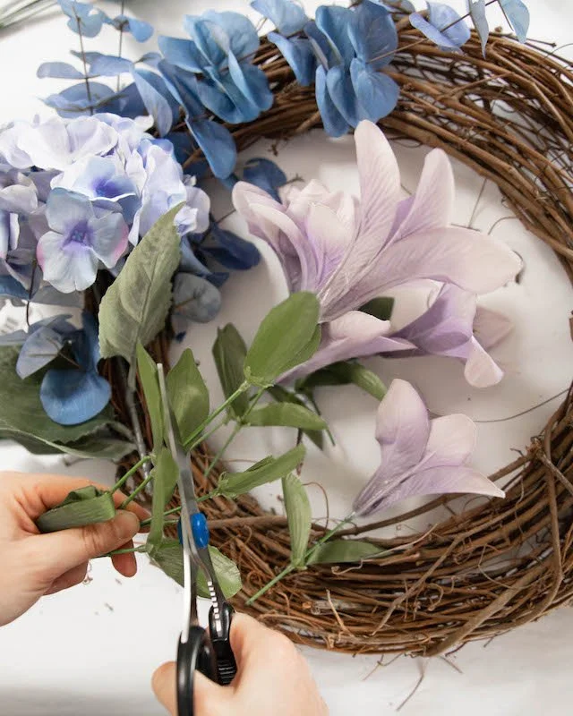
Once I decided on the colour palette, I returned to the artificial flower section to make my selection. Since lavender is one of my favourite colours and a popular Easter colour, I knew I wanted to stick to a cool tone palette, so I picked a variety of stems that added a variation of size, texture and colour with this in mind. To help me narrow down the options, I would lay them down on the wreath visualizing how they would go together and their placement. In the end I bought a total of 8 stems which ended up being the perfect amount.

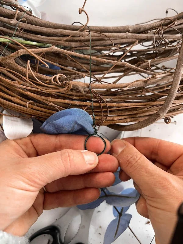
Upon returning home, I laid all my flowers out on my crafting table along with a sharp pair of scissors and some floral wire I had also purchased. Using my hands, I started to manipulate one of the stems around the grapevine wreath, tying it into place by wrapping wire generously around both it and the grapevine. Once secure, I cut off the unsightly bottom of the stem and repeated the process with my largest flower, a faux hydrangea. After the first stem (my base) and largest flowers (my anchor) were securely tied to the grapevine, I was then able to start using my scissors to cut off the other flowers from their stem and just push them into the small crevices within the grapevine wreath to secure them. Between the tightness of the wire and the density of the grapevine, all additional flowers stand in place without requiring additional wire or glue to secure them which ended up making the rest of my DIY outdoor spring wreath progress very fast. It also made placement of the flowers forgiving as I was able to try different positions easily.


CHECK OUT THESE OTHER FUN DIY’S


HOW TO MAKE A BOW FOR A WREATH

In addition to flowers, adding a bow to your wreath is another great way to add variety and dimension to your design. Making a bow can easily be done at home and doesn’t take much time at all. If you are unsure of how to make one yourself or have a hard time remembering, here are two easy tutorials that demonstrate how to make a bow for a wreath.

HANGING YOUR OUTDOOR FLORAL SPRING WREATH

Once I finished placing all my flowers onto the wreath, I now needed to figure out a way to attach it to the door. Using my floral wire I created a small loop around my fingers and fastened it to the grapevine by twisting it around both the loop and grapevine. Doing so allowed me to create a small hanging loop for my now completed wreath that fit perfectly over a small nail already protruding from my front door.

In the end, my DIY wreath for spring turned out amazing and I am so happy with the results. If you are thinking about creating an outdoor spring wreath for your home and have any further questions about how to make a wreath that I did not answer in this blog post, feel free to leave them in the comment section below!

Happy crafting!


PIN THIS POST

SPILLING TEA: ALL MY JUICY RENO PLANS & INSPO!

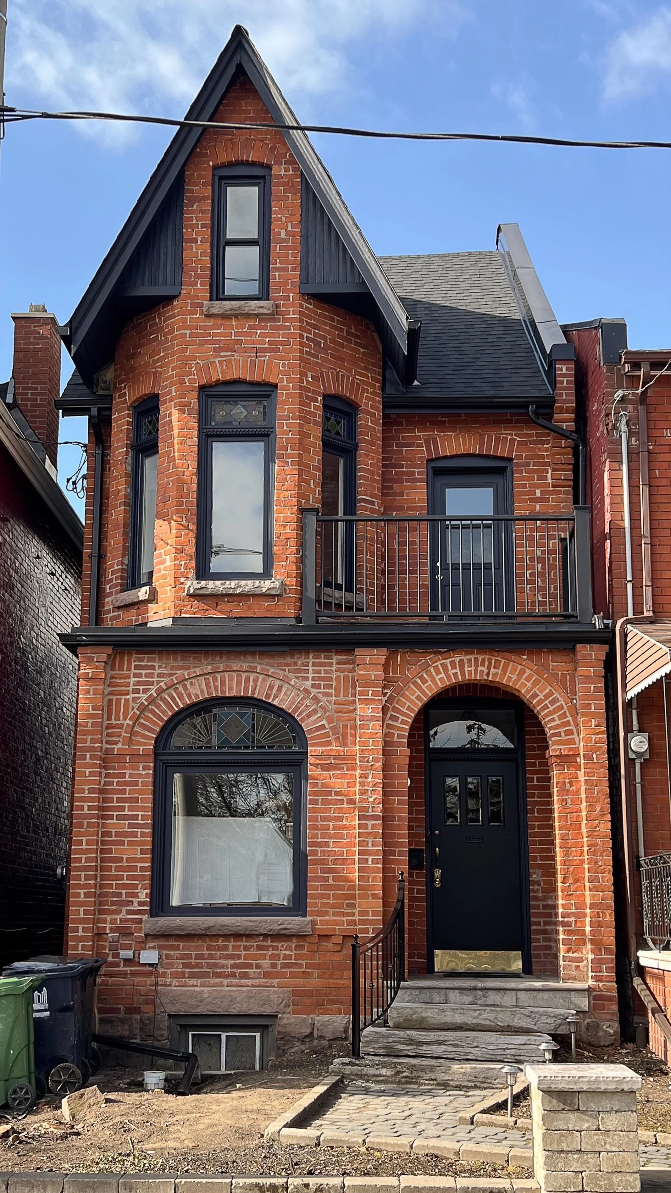
My Romanesque style Toronto Victorian home


It’s been almost six months since we moved into our Toronto Victorian Home and yet waking up and walking from one room to the next still feels so unreal sometimes. The spark we first felt when we initially toured the house is still very much alive and it all just goes to show that our crazy first time home buyer experience was worth the struggles. In the end, we found a beautiful house in a great neighborhood that we have been loving learning more about and exploring.

OUR CREEPY HIDDEN STAIRCASE

Being over 125 years old, our Romanesque style Victorian home does come with its fair share of quirks. For one, we discovered a creepy hidden staircase in a wall while planning out our main floor renovations! We suspect it was closed off to hide plumbing to the second floor bathroom and make room for a new staircase to the basement, but given it features the same high baseboards you see in other parts of the house, the staircase was likely part of the original house.

Additionally, when we bought the house we noticed that the floors sagged. This is a common characteristic of old houses usually equated to their age, but upon further inspection by our structural engineer, we began to suspect that load bearing walls in the basement had been removed by a previous owner at some point. Thankfully the foundation of the building is sound and our renovation plans will address this issue.


FOLLOW ME ON INSTAGRAM @ISTHATSOH


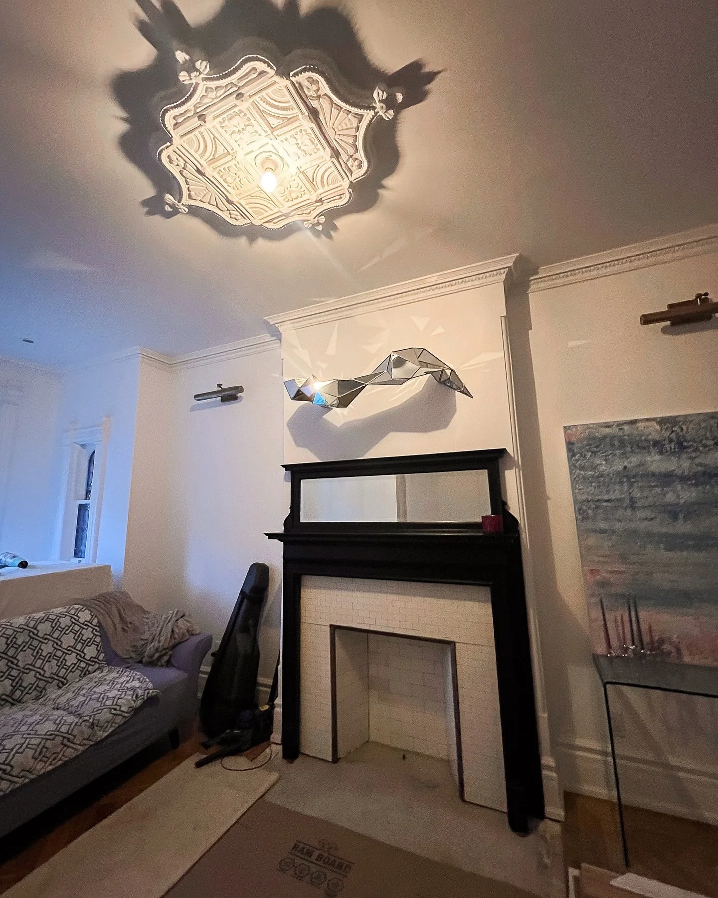
One thing I am 1000% doing is preserving the historical charm of the house as much as possible. Both the entrance way and drawing room feature high baseboards and crown molding centered around exquisite Victorian ceiling medallions. I also love the original ornamental molding that can be found throughout the first floor that embellishes the doorways including the main entrance. Unfortunately, a lot of these decorative molding features have been removed from the second floor, so one thing I’m definitely including on my ‘to do’ list is custom mill work to incorporate it back in.

Speaking of ‘to do list’, the reason why I am sharing today’s post is not only to expand on my pre reno tour, kitchen appliance tips, and share interior design inspiration for my upcoming renovations but it’s also to introduce a new Youtube series I’m going to be filming, documenting our renovation journey! I feel like this house and first floor renovation is going to be an amazing opportunity to share about my love for design and create entertaining content to excite you. There no doubt will be challenges but it’s in those challenges that great stories are made so I hope you will join me on this journey.

Of course, by way of this blog post I also wanted to give you a sneak peak into all the beautiful inspiration I’ve been collecting, what we are planning, and why we called in a structural engineer to help us. SPOILER: it goes beyond sagging floors!


RENOVATING A VICTORIAN HOME

Given our budget after buying the house and the fact that it is currently split into two units, Adam and I decided the best way to approach our top to bottom renovation is to split each floor into phases. This way, we can continue to live in the house during the renovations while still having a working kitchen on the second floor.

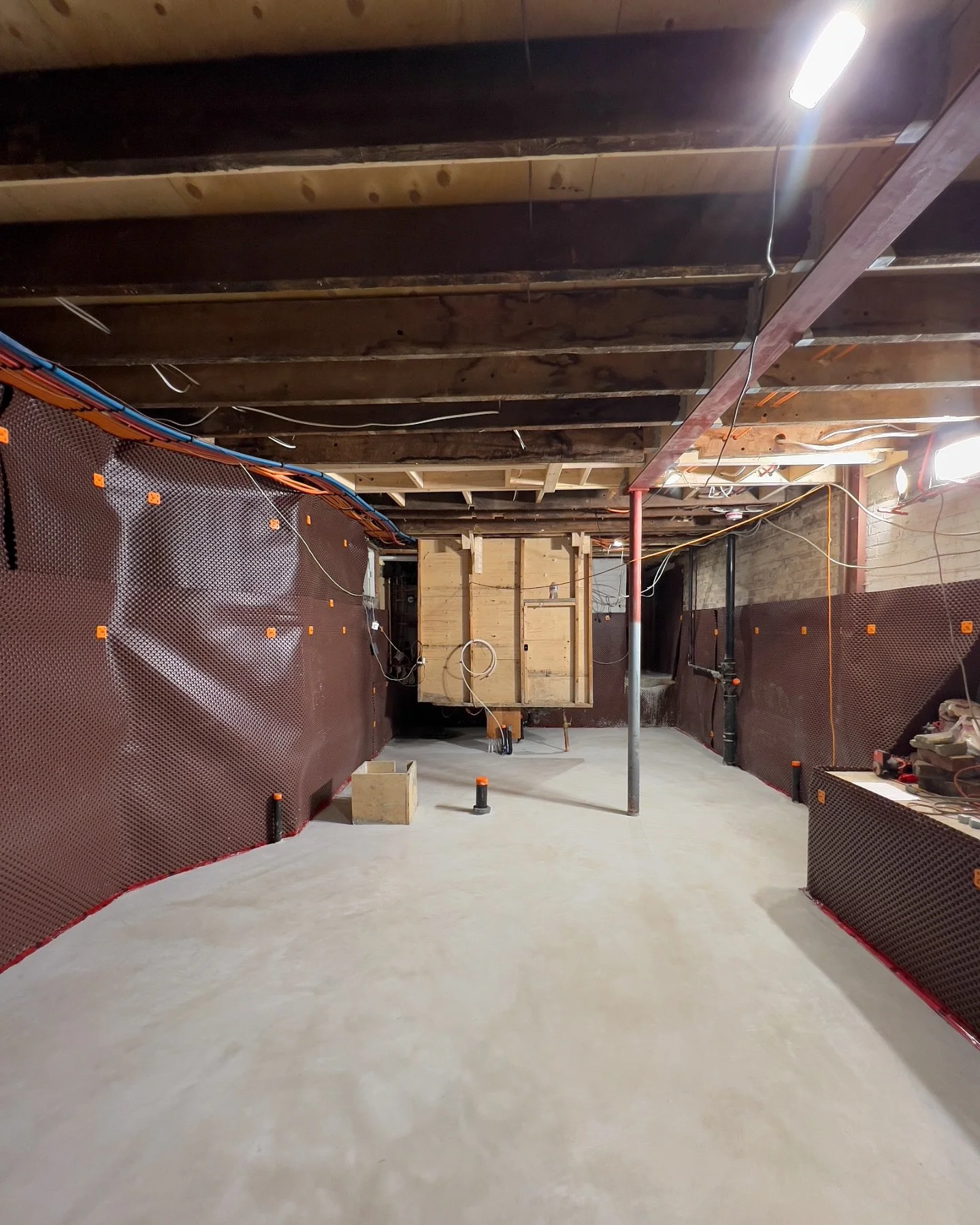
As you have probably guessed by now, phase one of this project is going to include a complete first floor renovation. Structural changes to support this, including widening the staircases on both the main and lower floor, will also be taking place as well as reintroducing an entrance way from the front hallway into the drawing room and removing unoriginal walls to create an open concept layout towards the back of the house where you will find a new kitchen, powder room, and bar. The sun-room at the back of the house will eventually be demolished so as to reclaim more of the backyard and a larger door opening will be created to replace it allowing for maximum natural light.

I will be elaborating further about these design choices throughout this blog post as well as providing inspirational images to help you visualize what we are planning. So without further ado, let’s start with diving into each element our renovation plan starting with structural changes.


STRUCTURAL CHANGES

I knew prior to starting our first time home buying journey that I loved Victorian homes so while on our quest we visited many renovated Toronto Victorian homes. A common repeated feature we noticed was an open concept layout on the first floor which, when paired with high ceilings, not only made the house look bigger but grander! Since original walls only seem to exist at the front of our house, Adam and I had no hesitations when deciding to alter the main floor layout by removing walls to make room for a larger kitchen and overall entertaining space. We learned that making these layout changes would require additional steel beams to provide stability and prevent structural issues that could arise later in the other phases of our renovations.

Additionally, since we wanted to demolish the sunroom and reclaim more backyard space we saw this as an opportunity to install a larger opening for a new doorway leading to the backyard. Doing this would require a steal frame to be installed to support the brick wall at the back of the house.

Pre Reno Kitchen and Sun Room - Photo Cred Raffi Tutundijan @jaggedlens

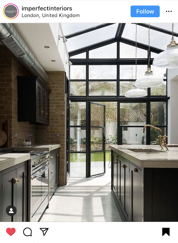
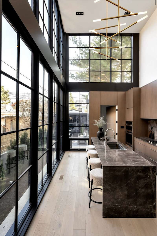
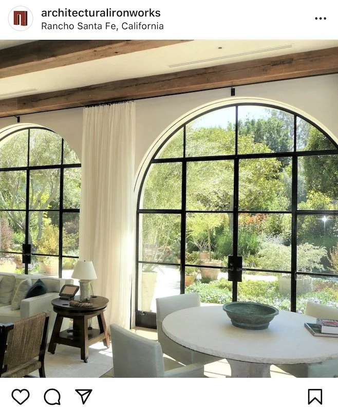
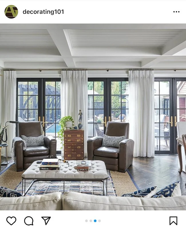
CRITTALL STYLE DOORS

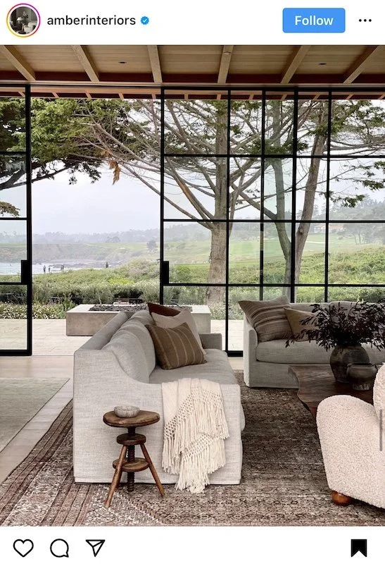
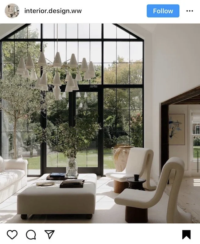
Originally, Adam and I were thinking of doing a large steel Crittall style doors as the back entrance door, however after pricing it out and seeing what the lead times would be to have one made big enough for the opening (it would have to be custom made) we got cold feet.

Living in a cold climate, steel Crittall doors aren’t known for being the most energy efficient door systems since they aren’t great at preventing heat from escaping or blocking the cold from coming in. The Toronto Building Code does have a minimum thermal break requirement for all external doors which is why aluminum doors or fiberglass doors are more common (they offer superior energy efficiency when compared to steel) as well as cheaper. Alas, we are still undecided which way we will go but here’s some inspiration of what we are thinking.


ENJOYING THIS POST? CHECK OUT SOME OF MY OTHER RECENT LIFESTYLE POSTS


Further, it wasn’t until we moved in and tried to get furniture to the second floor and basement that we realized how narrow our staircases are! When it comes to staircases, Toronto’s current building code requires staircases in new builds to be a minimum of 36 inch wide. Historically, staircases were never this wide and although our staircase is not original, the opening was never widened by a previous owner. Our staircase comes in at 27 inches making it extremely hard to fit assembled furniture upstairs. For the longest time Adam and I wracked out heads trying to figure out how the previous owners managed to get the kitchen appliances up to the second floor. It wasn’t until we finally measured the width of the doorway to the small front balcony off our master bedroom that we figured out they must have removed the door temporarily and craned them in through the small balcony! Crazy right!? One of the biggest and possibly most pivotal decisions we had to make when putting together our renovation plans was figuring out whether we were going to address our narrow stair issue, how it would impact the structure of the home, and how much widening and replacing both staircases would be.

WOOD STAIRCASE DESIGNS

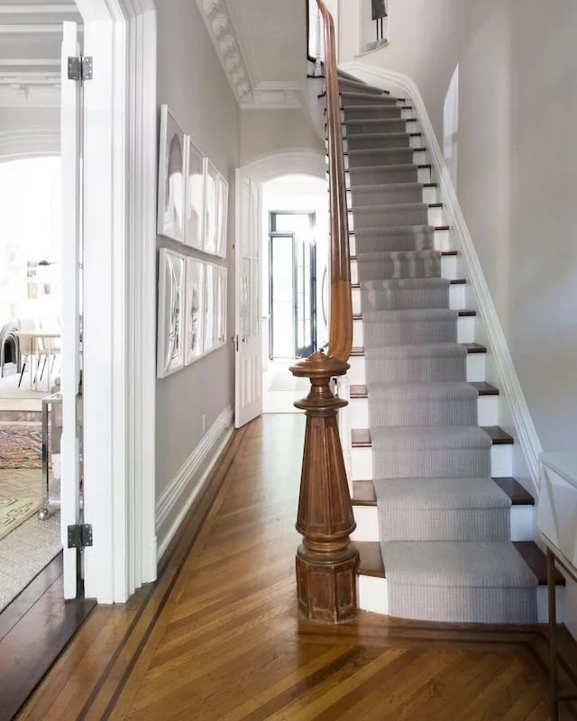
After finally deciding to move forward with widening the staircases, Adam and I debated whether to go more modern or keep it classic with the new stairs. We both love the look of floating stairs but given how much traditional character the house has, we ended up going for a more traditional design. But I’m sure we will add a modern twist somehow.

Lastly, structural issues in the basement that caused the floors on the main level to sag needed to be addressed before we can lay down a new subfloor and install new floors. To do this it seems that a few new beams will have to go in on the lower level - especially at the front of the house - to ensure the new floors won’t buckle a few years down the road. Installing these new beams will be also help us address the issues on unsupported over-spanned joists that we believe were caused by the removal of a load bearing wall in the basement by a previous owner.

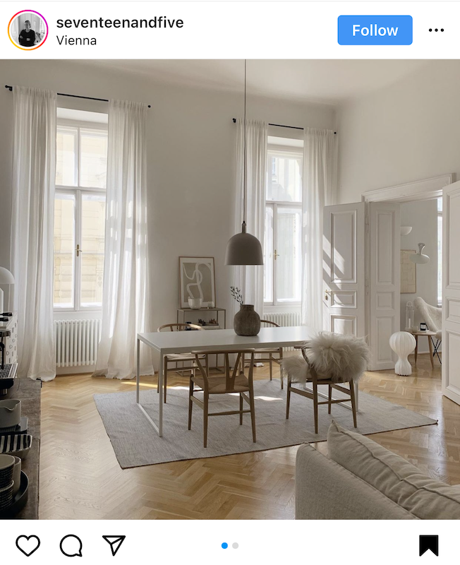
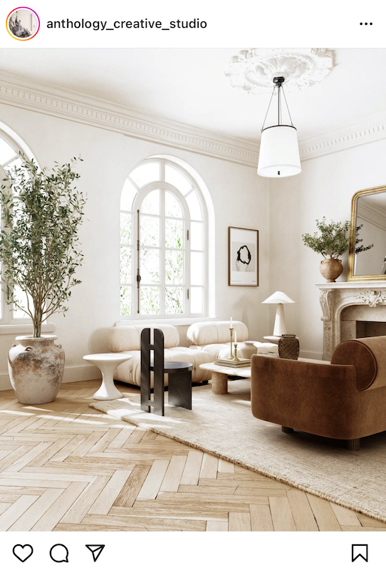
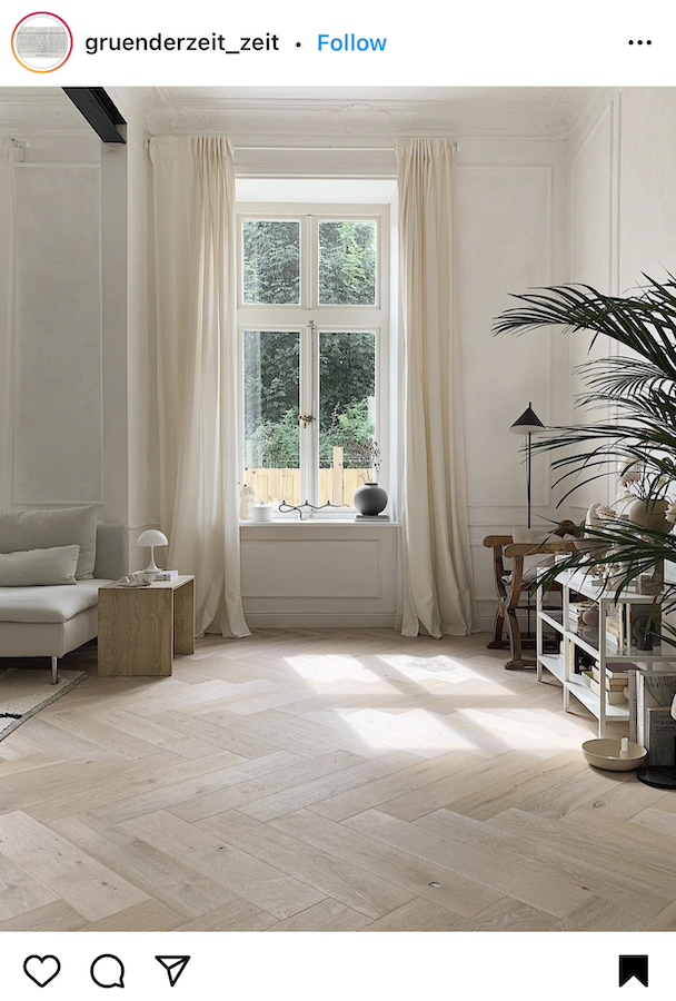
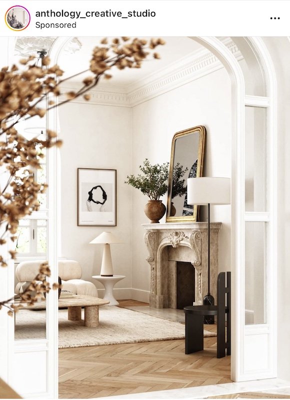
Speaking of floors, I’ve been obsessed with mosaic and herringbone floors for years! Prior to buying a house, I told Adam that I hope whatever we ended up with needed new floors so I would have an built in excuse. During our viewings we saw a few Toronto Victorian's with mosaic and inlaid floors that only continued to fuel my obsession.


CURRENT FLOORING

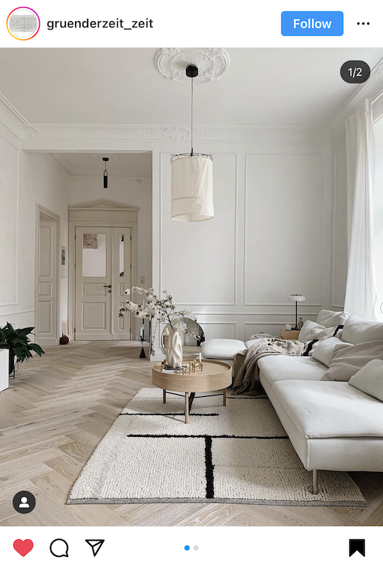
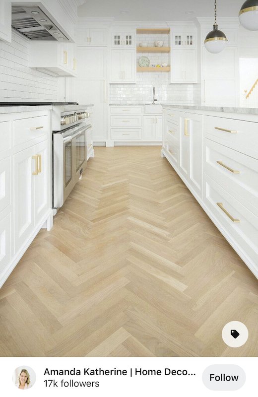
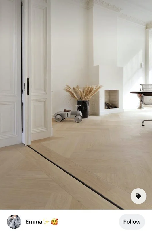
Currently, the main floor has three different types of flooring going on, one of which does look original. However, it’s only a small section at the back and they aren’t in the greatest shape. If there was more of it and it was in better shape I may reconsider redoing the floors, but in our case this is one ‘out with the old in with the new’ sacrifice I’m willing to make. Traditionally herringbone floors were made of oak and these days you can get them in engineered oak in many different sizes and colours. Narrowing it down to a size was exceptionally hard given the size of the space. Too large and you don’t notice them, but too small and it’s all you notice. It needs to be balanced! In the end we went with a 90 mm natural oak herringbone colour which I am so excited about. It’s going to add warmth back into the space and match beautifully with what we have planned for the kitchen. I can’t wait!

HERRINGBONE FLOOR INSPO

I’ve shared a little bit about the kitchen appliances we ordered a few months back but when it comes to designing my dream kitchen you can bet it won’t be all white! In order to ensure flawless execution for this part of the project, I brought in the big guns, Domani Design Group. Not only does Domani distribute luxury European brands like Pedini but they also specialize in custom cabinetry for both kitchens and bathrooms as well as custom millwork! Just what I needed!

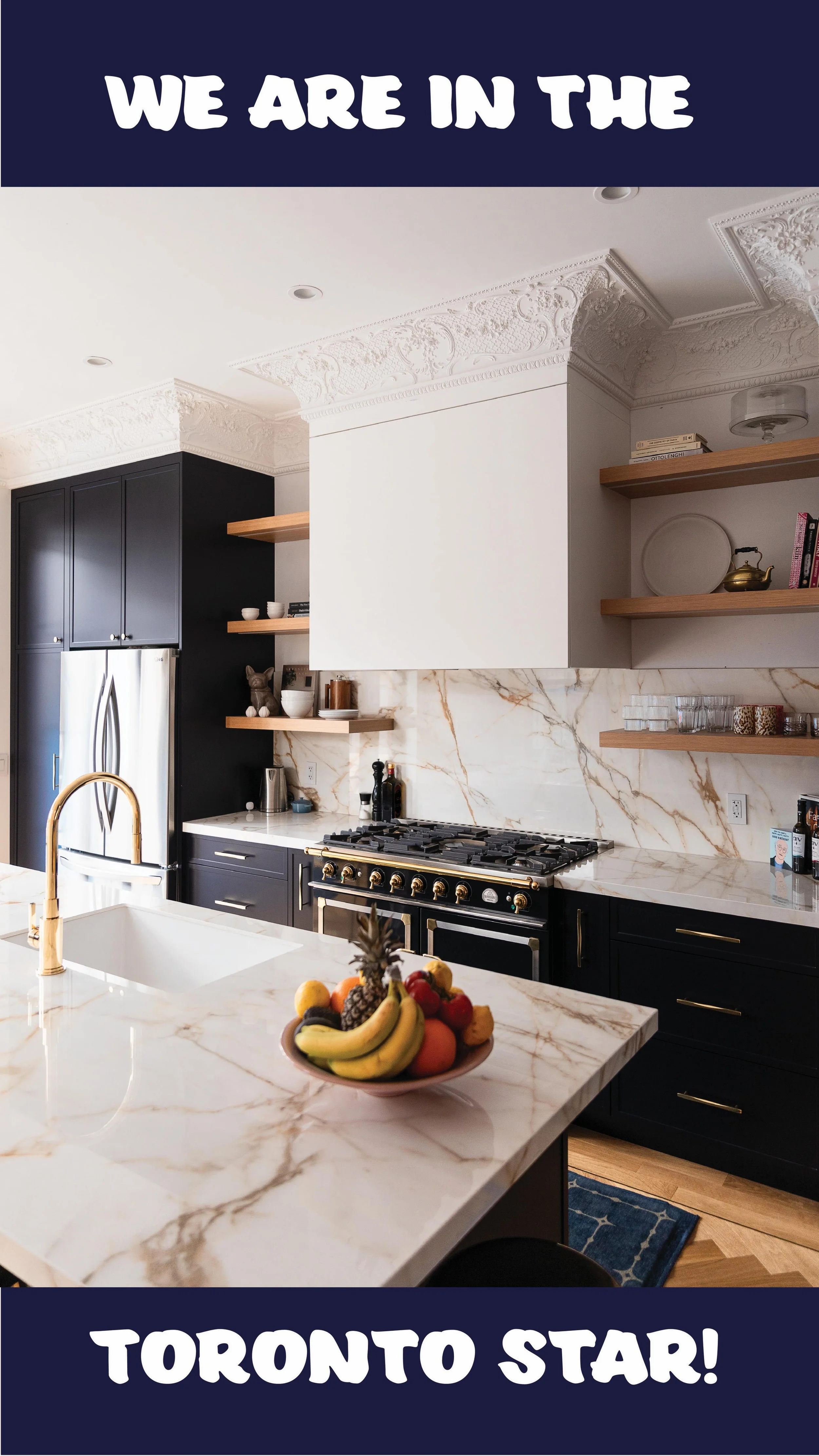
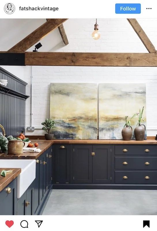
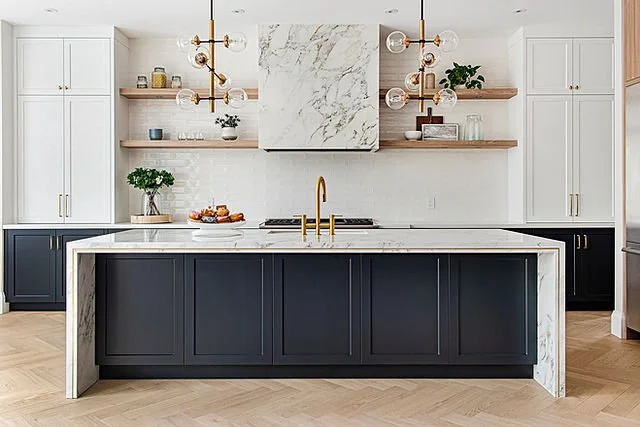
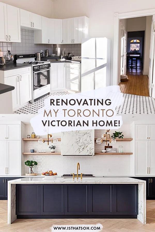
To us, the kitchen is truly the heart of the house and both Adam and I love to cook and entertain. With 10 foot ceilings and an open concept layout, I wanted the kitchen to feel airy but still anchoring, warm and full of natural light. Currently we have two big beautiful windows in our hallway that we plan to position the island between. For cabinetry we are keeping it simple, timeless, and classic but modern with a shaker style kitchen in a dark French navy to match our La Cornue range in the same colour with brass accents. The La Cornue range is going to be the centrepiece so I wanted cabinetry to compliment it, but not compete.

SHAKER STYLE KITCHEN INSPO

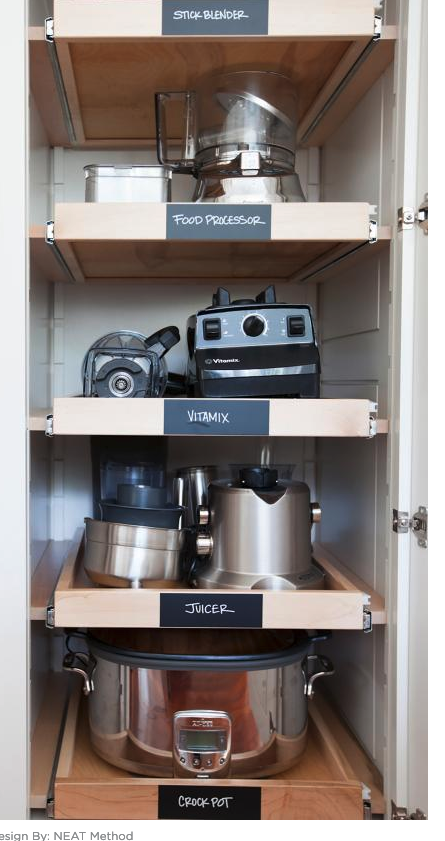
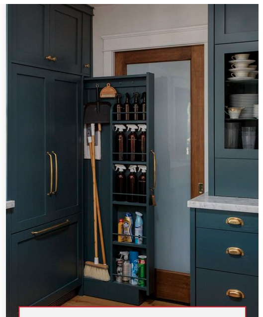
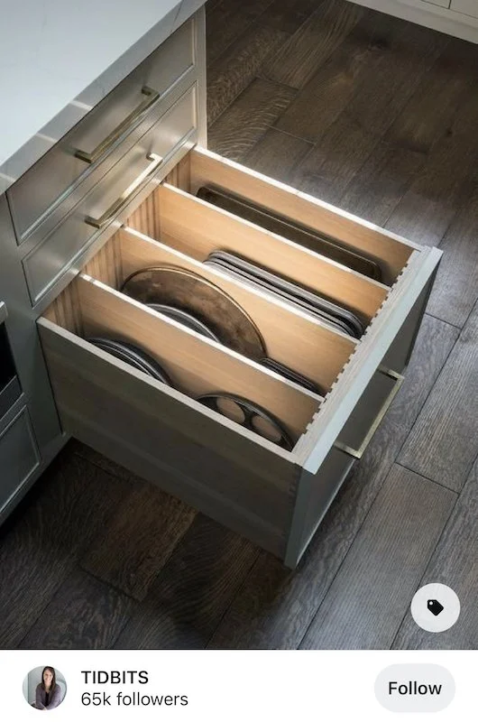
A warm porcelain countertop in a Calacatta with brown-gold warms up the space and plays on the natural oak herringbone floors. Floating shelves in a cool natural wood surround a simple and understated range hood which extends all the way to the ceiling to accentuate the height of the room. Bar seating will surround the kitchen island sink. I have even gone so far as to start to think how I will organize the kitchen and have submitted special millwork request to Oscar at Domani including a pull out spice rack and cabinet pull out drawers for my small appliances! I’m so excited!


KITCHEN STORAGE & ORGANIZATION IDEAS


I obviously don’t expect this renovation to go smoothly. I’m actually banking that it’s not so that I have some great stories to come back and share, but I am super excited for all that is to come. I’m also super excited to document and create my Youtube series around it so you guys can get a sense of the process too! If you aren’t following me already make sure to subscribe to my YouTube channel and follow me on Instagram for updates on this phase 1 renovation and more design projects I have in mind!


PIN THIS POST